
Brand Guidelines & Templates
Logos
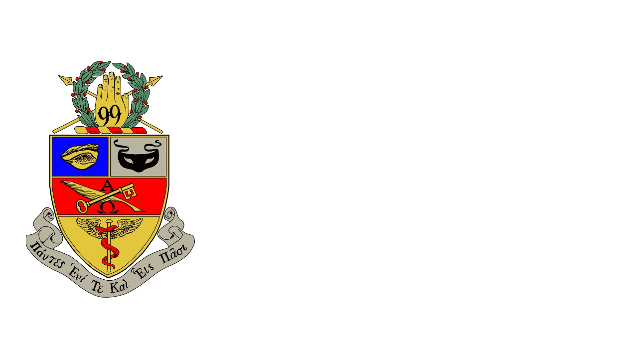
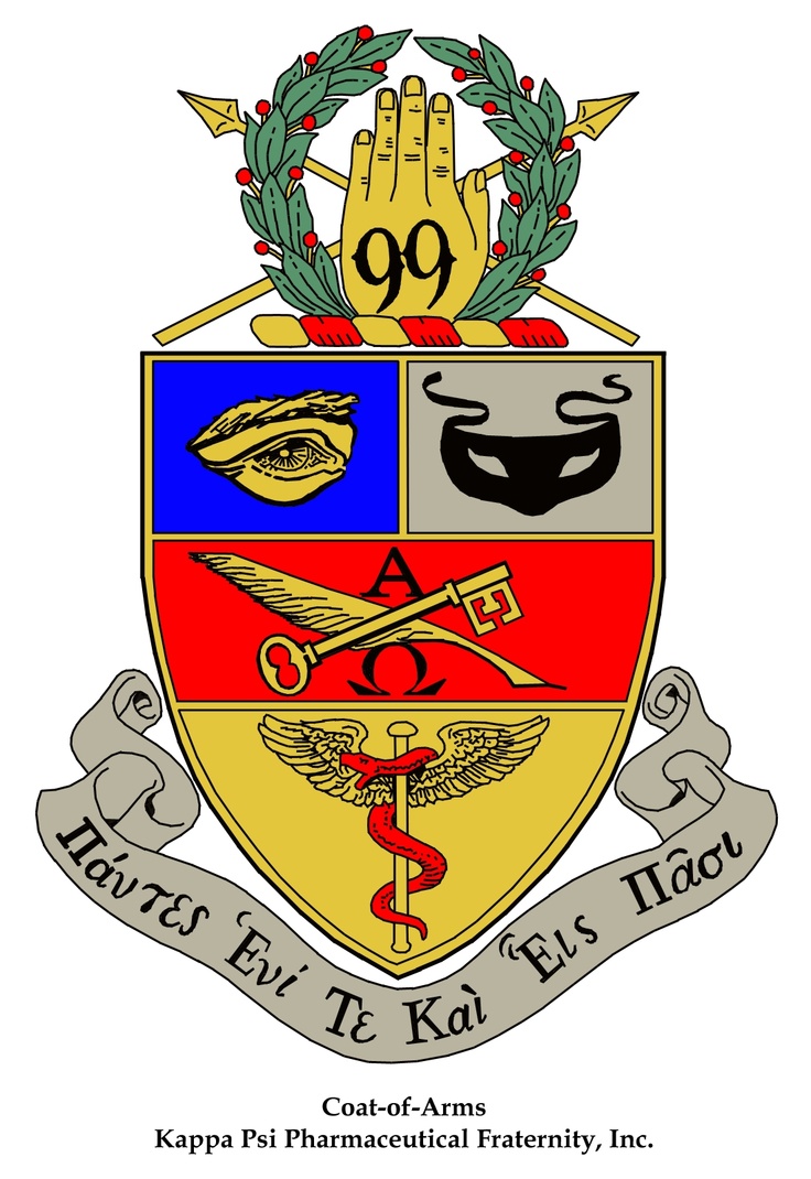
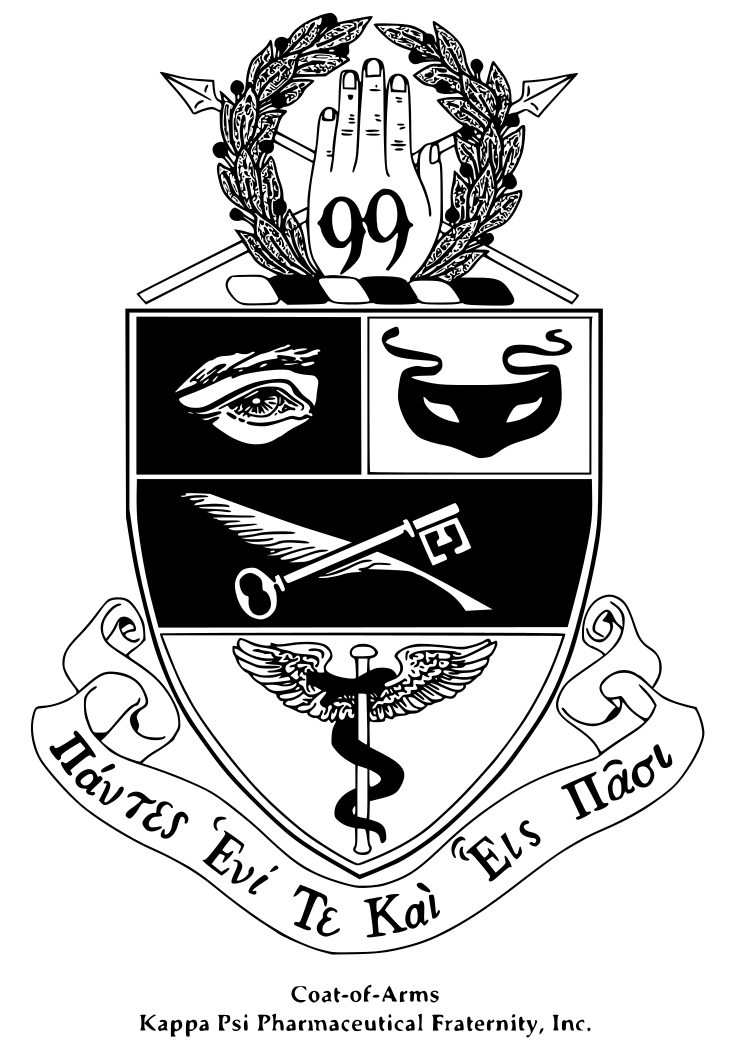
One Logo
Kappa Psi is a master brand and has a single logo, emphasizing our brand and our message as brothers united for life. Our pillars of Industry, Fellowship, Sobriety, and High Ideals are inherently represented when our logos are used.
Province's may create their own sub-brand but may not interfere, replace, or clash with the master brand. Groups (provinces, chapters, committees, positions, etc.) can add their name by using a specific brand-approved treatment after the logo but may not create their own logo treatments. In rare cases, exceptions may be considered when there are extenuating circumstances such as legal partnerships, but all exceptions must be approved by contacting webmaster@kappapsi.org.
Stacked vs. Horizontal
There are two primary versions of the Kappa Psi logo; stacked and horizontal. The primary driver for determining your choice will usual depend on space constraints.
Stacked Logo - Color/ White

Horizontal Logos
There are multiple acceptable forms of the horizontal logo. The most frequent use case will be to distinguish a province, chapter, or committee. Please read below in its entirety to familiarize yourself with the nuances in this use case.
If you are familiar with vector graphics, you may download the horizontal logo format and create your logo. Please read the guidelines below to make sure you are following the rules outlined.

Only International Committees may be spelled out on their own. Committees at the Province or Chapter level should be displayed alongside their respective sub-group (ex. Northwest Province - Legislative Committee).

Above is an example of how Provinces can distinguish themselves.

Chapter names should always come after their Province name separated by a dash with one space on either side of the dash.

For internal documents circulated only among the respective chapter, the Province name can be omitted. With the additional room, the Chapter may decide to include their school's name after their Chapter's name. Note: It is often against trademark rules to associate or incorporate a school's name with another organization's brand. Please check with your school for clarification.
Color Palette
The color palette communicates a unified voice that helps the audience identify Kappa Psi media and collateral at a glance.
All Kappa Psi material must strictly adhere to the outlined color palette. No other colors, including variations or gradations of these colors, may be used. For color use, less is more. Use white as the dominant color on your projects. Especially when dealing with print material, dark backgrounds do not reproduce well on physical mediums.


Fonts and Typography
Acceptable Usage
An important part of Kappa Psi’s graphic identity is the use of clean, consistent typography. These typefaces should be used for Kappa Psi’s newsletters, brochures, advertisements, reports, certificates, flyers, invitations and publications.
Preferred Font Pair
Arial can be used for for subheads (18 pt) and body copy (11 pt). The smallest recommended size for this type is 5 point.
Promotional Material
For materials that are not text heavy, a suitable alternative font pair is Playfair for headings and Montserrat for body text.
Alternate Fonts Pair
If you don’t have access to the recommended font pair, you may substitute the heading and subheading font for another serif font (has a small line attached to the end of a stroke) with the body text consisting of a sans-serif font (no additional lines or marks at the end of a stroke). Keep in mind legibility and contrast between the backgrounds. Certain fonts may look better printed while others may look better on a digital display. Take into account the medium that the end-user will be reading from.